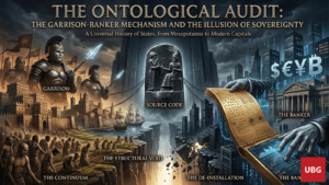
Ontological Honesty in Data Visualization: Why Polar Coordinates Beat Cartesian Deception
Ontological Honesty in Data Visualization: Why Polar Coordinates Beat Cartesian Deception
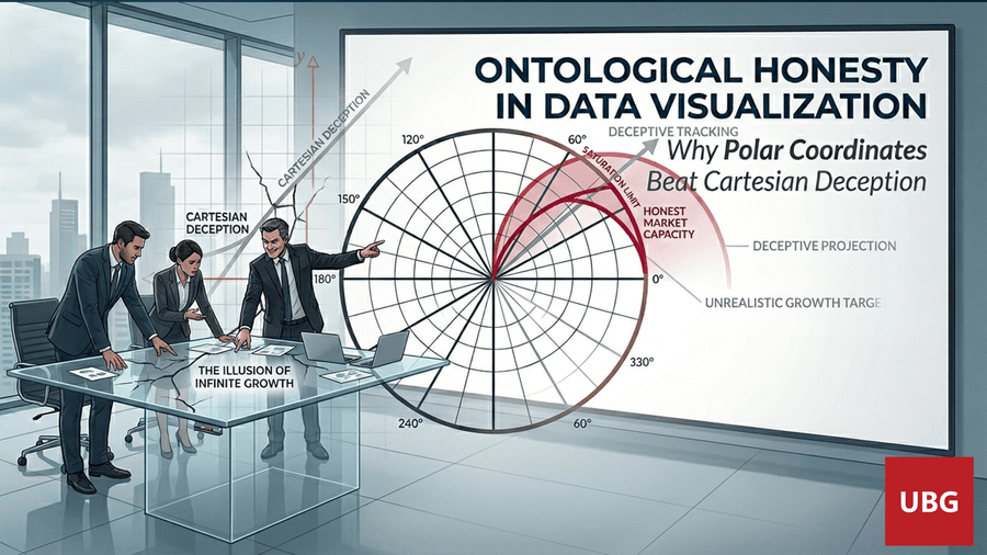
In the realm of business intelligence, we often mistake the map for the territory. For decades, the Cartesian coordinate system has held a monopoly on how we visualize business performance. From revenue projections to market penetration, if it is a graph, it is almost certainly plotted on an x and y axis.
As an ontologist, I view this not merely as a technical choice, but as a fundamental categorical error. By forcing finite, cyclical, and constraint-bound business realities into the infinite, unbounded geometry of the Cartesian plane, we are fundamentally misrepresenting the nature of the entities we claim to manage.
The Cartesian Illusion: Mapping Infinity onto Scarcity
The Cartesian plane is rooted in Euclidean geometry, which treats space as an infinite, open expanse. When we plot business data on this grid, we are implicitly adopting a mindset of limitless growth. The line goes “up and to the right,” extending toward infinity, suggesting that there is no ceiling to our market, no end to our resources, and no limit to our capacity.
In reality, every business operates as a finite system. Capital is finite; markets are saturated; supply chains have specific capacities. By utilizing a coordinate system that possesses no inherent boundary, we are using a model that is ontologically incapable of representing the existence of limits.
Intellectual Laziness: The Default Trap
The persistence of the Cartesian grid is largely a product of intellectual laziness. It is the “default” of modern data visualization—the path of least resistance. Analysts are conditioned to input data into a spreadsheet and generate an x,ychart without questioning the ontological alignment between the data and the geometry. We have prioritized the convenience of the tool over the accuracy of the model, settling for a representation that is fundamentally ill-suited to the nature of business operations.
The Sophistry of the “Rosy” Dashboard
Beyond mere laziness lies a more calculated deception. In the boardroom, the Cartesian chart has become the preferred instrument of the corporate sophist.
Because the Cartesian graph provides no visual “wall” or boundary, it is the perfect tool for masking diminishing returns. A manager attempting to sell an unrealistic growth narrative relies on the Cartesian line chart. It allows for the visual obfuscation of market saturation; the line simply continues to rise, creating a “rosy” picture that placates stakeholders while obscuring the reality that the business has hit its functional limits. It is a form of visual propaganda that prioritizes emotional comfort over existential truth.
The Polar Truth: Modeling Reality
Polar coordinates offer a necessary correction. By mapping data using a radius (r) and an angle (θ), we transition from an infinite plane to a defined, bounded space.
In a polar system, the perimeter of the graph acts as the natural horizon of the business. When you plot your progress on a polar radar or radial chart, you are not looking at a vector extending to infinity; you are looking at your position relative to the maximum capacity of your system. You are seeing saturation, cyclicity, and constraint in real-time.
A polar visualization forces the viewer to confront the “wall.” It transforms the question from “how much more?” to “how much capacity is left?” This is the essence of ontological honesty. A graph that accurately portrays the finite, cyclical nature of a business is not just a better visualization—it is the only one that remains truthful to the business’s actual existence.
The Audit of Truth
It is time to audit our dashboards. The next time you see a line chart trending “up and to the right,” you must ask: “Where is the boundary?”
If your analysts cannot show you the physical limits of the system you are operating, they are either too lazy to understand the geometry of their own data, or they are being paid to hide the truth from you. In either case, the Cartesian grid is keeping your organization in the dark. As managers and ontologists, we must demand visualizations that respect the finite nature of our resources and the cyclical reality of our markets. Anything less is not analytics—it is a fairy tale.